|
|
Post by toffee200304 on Aug 20, 2008 5:37:43 GMT -7
We're an rp based around a school for pregnant and parenting teens along with any others who get sent there for various reasons. We opened on 24th June and would love some input! gymslip parentsthanks |
|
|
|
Post by krista! on Aug 20, 2008 16:32:54 GMT -7
first impression!
the skin isn't blinding kudos! i'm not a fan of the colours (i have something against light colours? i don't know) but they do match and go along with the site and the theme of the site. the site seems pretty organised.
organisation!
well under "ooc" you have two character boards. maybe consider making another category for character interaction or just other character stuff? if you consider having contacts like mobiles or myspace or something that could be a good place to put it. announcements and rules are easy to find, and the plot is easy to find there, too.
rules!
"; Please try and stay active, if your not .r. going to be here for a while post a thread to tell us or PM a staff member"
it should be "you're" as in "you are".
"; When roleplaying post in third person"
this rule has been said before, so it's a bit repetitive.
suggestions area
i suggest making a guest-friendly suggestions/comments/questions board. these are necessary in the case that a guest would like to join but has questions, or wishes to contact the admin about it first.
i hope this helps!
x
|
|
|
|
Post by toffee200304 on Aug 20, 2008 18:53:49 GMT -7
Thanks,
The skin colors can't really go dark as it would ruin the plot pages. I'm glad you think they go well together and stuff though, it's just unfortunate about the colours. If we had complaints about it being unreadable and blinding it would be changed to darker in a flash though, just seemed more fitting to be lighter and softer, seems to represent babies more for some reason.
I need to get round to doing that, it'll have to be tomorrow now as it's late and I should be in bed but it will be done, I just hadn't noticed it.
Thanks, again I hadn't noticed that, they've both been changed now.
The suggestions area is in the general board. I'll add it to the links in the sidebar tomorrow but it is there and guest friendly. The FAQ is going to be set so that guests can ask questions there and they can be added for help with other guests. Thanks for raising this, it's not something I looked at properly before.
Thanks again, those things will be worked on once I've slept and as such am more awake!
|
|
Macy
member!

Posts: 21
|
Post by Macy on Aug 20, 2008 21:51:52 GMT -7
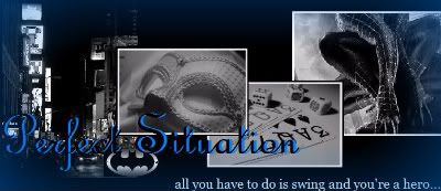
♠♠ Macy’s Critique<<< Ahh, well though you've already been critiqued, I cannot help but add my own opinion. So, sorry! But...I've seen your site before and now I have the chance to tell you what I think. No, it's not bad. I think your site is very creative and great. ;] - I really adore your skin! Like Krista, I dislike light skins and tend to cringe whenever I see them, but the colours you chose mesh extremely well and they aren't blinding to the eye. So kudos on that!
- The banner is very pretty as well as fitting towards your site, but personally banners that are only two colours are slightly boring. Maybe if you add some sort of border then it can add to the over all appearance of the site. Usually, the banner is what I look at first to decide whether I join a site or not.
- Going along with the banner, I would suggest you to find a new side table code that puts the side table right alongside the banner. There is this space in between the banner and the boards that just sort of looks off...just my opinion.
- The side images though are absolutely gorgeous and go very well with your skin. I love them. Don't change them because they are just very, very nice. That's another thing that makes me want to join a site.
- Lastly, I would suggest maybe taking out the topics & replies columns in your board-- I've seen some forums do this and it makes a difference sometimes. And, I included a site with many invision free codes at the bottom just to give you some reference =]
thecodingzone.com |
|
|
|
Post by toffee200304 on Aug 21, 2008 17:53:20 GMT -7
Thank you!
I'll work on a new banner but it may take me a few days, I'm a bit useless at them. We have two different ones up and it chooses them randomly at the minute, to keep it a bit more interesting but I do agree, they are boring.
That box is the google ads. They don't seem to show up 100% of the time, not sure why though. It vanishes when viewing threads though. It made the nav links go weird when I moved them so they'll stay that way for now, thanks anyway.
I'll look into that, will test it in a test board first but if it looks ok it should be up in not too long!
Thanks again! And thanks for the link, it'll really help!
|
|
|
|
Post by toffee200304 on Aug 23, 2008 16:11:42 GMT -7
The new banner's up, replies/topics column has gone our suggestion/question board has been moved to somewhere more obvious and I moved any IC bits out of the OOC category. I think that about covers everything?
Thanks for all the help!
|
|